Proofing Your Book Prior to Submission
Generate a watermarked proof pdf of your book prior to submitting it to ensure your layouts are in tip-top shape. You can also download the pdf proofs to share with other members of your school community to proof-read in detail.
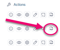
To generate a pdf preview:
- Click PDF Proof
- Click Select All to include all pages in the book, or checkmark individual sections to generate a single pdf for those pages alone
- Click OK to generate the pdf. Note that this may take a few minutes.
- Optional: click on the DOWNLOAD button to receive a copy of the pdf file which you can share with other or PRINT to send the pdf proof to your local printer, suitable for mark-up and notes.

Below is a list of potential issues to look for while reviewing your book within Pixami.
Note: After you submit your proof, you will have access to a higher resolution unwatermarked pdf version of your book at cover.
Proofing Checklist
Watermark & Copyright Issues
Review the entire book, including the cover, for potential copyright violations.
- Are there any trademarked images used to decorate the book? Examples include: licensed characters, logos, art from books, movies, tv shows, streaming content, independent artists unaffiliated with your school, video games, etc.
- Do any images display ™, ®, © symbols, or watermarks indicating image ownership rights? (Look carefully, as watermarking can be subtle. Include backgrounds as well.)
These items need to be removed from your book if you have not obtained commercial licenses for the content.

Copyrighted / trademarked content may not be used in your yearbook. The Studio Source team specifically flags books for copyright violations, and will request amendments to the book to remove unlicensed content before printing. This is done to protect your school and all involved parties from potential lawsuits. We recommend using graphics provided in the Studio Source Catalog and Pixami exclusively to avoid any issues.
The following is not permitted without a specific usage license: Watermarked graphics • Characters, logos, art from books, movies, tv shows, websites, video games, etc. used in a decorative capacity • original art or photography used without the consent of the content license-holders (eg. celebrity photos, web downloads that are not public domain or commercially distributable by license, works created by independent artists used without their knowledge or consent, content from news outlets).
Fair use: Product logos or promotional materials may be used in an editorial (not decorative) capacity, or in original photography as an incidental inclusion at a public event. A book inspired by a commercial property’s styling is permissible, providing that all artwork used is not owned by the property and no logos or proprietary imagery are used.
Examples:
> A page with the theme of Our Favorite Things may include small images of a movie poster, an album cover or a company logo, but it may not include a news service photo.
> A Reading Across America page may include Dr. Seuss related content, such as original photos of an onsite banner, the event poster, books in a library, or kids in costume, but the page may not contain original Dr. Seuss artwork used as backgrounds or clipart.
> A book styled like Diary of a Wimpy Kid, constructed as a parody with original student art and no content used from the original property; a Netflix or Spotify-inspired book that does not use logos or branding from the sites.)
Cover Issues
- Is the correct school year featured on the cover? (eg. 2023-2024 or 2024)
- Does the cover feature the school’s name prominently?
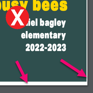
- Does the cover background and page-wide banners extend to the very outer edges through the bleed area? Check the untrimmed pdf, looking for white borders or gaps at the edge of the page. To learn more about covers, check out the Cover Design article.
- Is all the text and featured images a safe distance from the trim edge? (This should minimally be 1/4″ ideally 1/2″ or more from the trim edge of the book.) Use the flipbook to check.
- Is there text on the spine?
If yes, check the full cover preview below the flipbook for the following:- Is the spine wide enough to accommodate legible text (the book must contain 72 pages or more)?
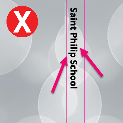
- Is the spine text centered within the guidelines?
- Does text cover less than 70% of the spine width?
- Are the spine margins kept clear of content from the front & back covers? Images and text should be at least 1/4″ from the spine guidelines.
- Is the spine color-blocked to the spine guidelines? Be sure to wrap any color at least 1/4″ onto the front & back covers to create a book-binding effect.

- Is all text on the cover unclipped in its frames?
- Are all images (photos, clipart) on the cover unclipped in their frames? Check for missing edges on clipart or cut-off faces.
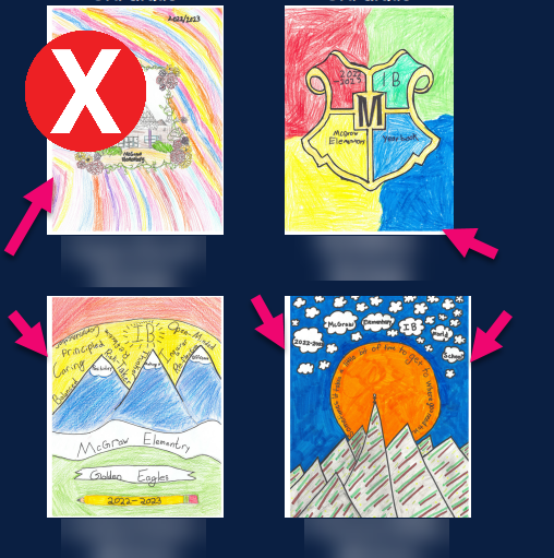
- Do any photos display a blank, black, or white edge on one or more sides? If so, these may be screenshots with extra blank area around them, which need to be resized to fill in their image frame.
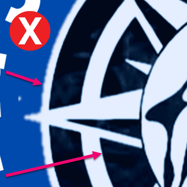
- Is the cover background image high resolution? Check for visible pixelation or “noise” spots on low-resolution images.
- Are all images (photos, clipart) on the cover high resolution? Check for visible blurriness or pixelation.
Tip:For more information on cover design, check out the Cover Design article.
Page Number Issues
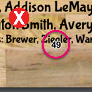
- Does this book have page numbers? If yes…
- Are all faces and text unobstructed by page numbers?
- Are the page numbers generally legible against their backgrounds?
- Are all page numbers far enough away from the safe area?
Tip: For page number formatting tips, check out the Additional Design Elements article.
Portrait Page Issues
Portrait Grids
- Are the portrait pages in the right order? (Eg. Grades 8, 7, 6, 4, 5, 3, 2, 1, K)
- Are the portrait grids within the safe margins of their pages?
- Do the grids include one or more feature frames at the front of their grids (eg. teachers’ portraits are larger). If so, check the following:
- Do only the appropriate staff members appear in featured portrait positions on classroom pages?
- Are any student portraits accidentally featured?
- Are there any teacher portraits mixed with the student portraits?
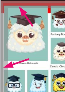
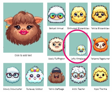
- Are the portrait images well-positioned in their frames? Check for portraits with extreme size differences, noticeably off-centered or cropped.
- Are individual portraits dramatically out of alignment to the grid? (eg. portraits manually added to the page)
- Are any students duplicated on their page? Check the labels for duplicate names – sometimes it is hard to spot the same person twice if they have a different haircut & outfit in two adjacent photos, or the two photos have been split onto separate rows.
- Are portraits following alphabetical order by last name, unless they are reordered for priority ranking?
- Are any students listed as “No Photo / Missing Photo” in fact in the portrait grid?
Portrait Labels
- Are portrait labels readable against the page background? Ensure that busy backgrounds or low contrast label-to-background colors do not make individual labels unreadable.
- Do all names in the portrait labels appear complete?
- Is the label text clipped on its bottom edge with low-lying letters chopped off their bottom edge?
- Are longer names (eg. hyphenated last names) extending outside the label area, clipped or under the portrait beneath them? Look for last names ending in a hyphen.
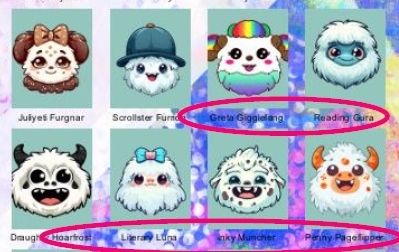
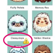
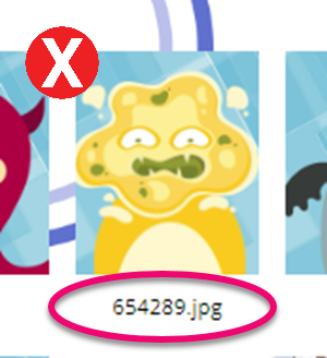
- Are there any obvious typos in the labels – such as the same name appearing as both the first and last name, only a single name, or the label featuring placeholder text for missing names?
- Do individual labels have a different font/ size compared to those on their page? Check for individual retake portraits with Open Sans default font.
- Does one portrait page have a different label styling than the other portrait pages?
- Are individual labels out of alignment (eg. lower down, not centered)? These may have been manually added to the page.
- Are the “No Photo / Missing Photo” lists consistent in styling from page to page, and placed in alignment with the grid?
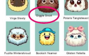
Portrait Page Titles
- Are the portrait page titles within the safe margin? Titles should be at least 1/4″ from the page edge.
- Do the portrait page titles have the same word order and general styling? (eg. “Mr. Smith’s Grade 5 Class” on one page, “2 – Emerson” on another)
- Are there any typos in the portrait page titles (eg. names ending in s, z or x should never have a possessive ‘s after them, only a ‘, eg. Mrs. Fitz’ Grade 1) or a mismatch between the homeroom teacher’s portrait label and the page title (eg. Mrs. Richardson on the title, Ms Richardson on the label)?
Tip: For more information on designing portrait pages, check out the Portrait Page Design article.
All Interior Pages
Backgrounds
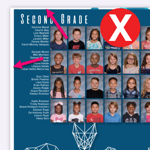
- Are all backgrounds full bleed? Check the full-bleed pdf for white edges around the background image.
- Are all backgrounds high resolution? Check for visible pixelation or “noise” from low-resolution images.
- Have broken spreads left any background or photo fragments on the outside edges (not the gutter) of the page? When two facing pages in a spread are split up, Pixami includes any content that crossed over the center of the spread with both pages. This leaves duplicated content on the page edge. Use the full bleed pdf to check for this issue.
General Placement Issues
- Are all text and featured images a safe distance from the page edge? Images and text should be inset at minimum 1/4″ from the page edges, including the gutter. Use the flipbook to check for this issue.
- Do images spilling off the page edges keep faces/people within the safe area of the page? Check for faces or people cut off on the page edges. Use the flipbook to check for this issue.
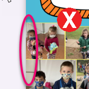
Images

- Are all images high resolution? Check for visible blurriness or pixelation.
- Are images of heads/faces clipped in their frames or covered by other photos?
- Is all clipart unclipped in it’s frame? Check for cut-off edges on either edges.
- Is all clipart unbordered, with a transparent area around it?
- Are there any images used twice in the book?
- Are there any empty image frames or large blank spaces?
- Do any photos display a blank, black, or white edge on one or more sides? If so, these may be screenshots with extra blank area around them, which need to be resized in their image frame.

Text
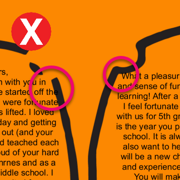
- Is all text readable against its background? Text on very busy backgrounds or that is not contrasted in color to stand out against the background is very hard to read.
- Is all text unclipped in its frame? Check for low-hanging letters that fall below the frame’s bottom edge.
- Are there any obvious typos or text formatting issues? Be sure to read the page titles too as these are often overlooked.
- Do any text frames display placeholder text (eg. “Add text”, “Lorem Ipsum…”, nonsense text)?

Ads & Preformatted Content
- Is there any preformatted content in the book, such as senior dedications, advertising, or entire pages created outside of Memento added as JPG images?
- Is this content respectful of the safe margins – with 1/4″ + margins to keep images and text away from the trim edge of the page?
- Is this content positioned within its image frame so it is not clipped by the frame edges?
- Is this content high resolution, with clear crisp text and unpixelated sharp images?


